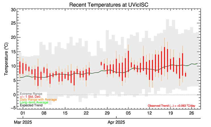
Past Month at Ian Stewart Complex/Mt. Douglas High School
What does this figure show?
This figure shows a summary of conditions at a particular site for the past month (horizontal axis). The vertical bars are centred on the daily mean, marked with a short horizonal line extending across the bar, and show the magnitude of one standard deviation above and below the mean. The whiskers extending above and below the bar show the range for each day, from the observed minimum to the maximum. The shaded area shows the historical range of extremes for each day. The green line is the historical average. The thin straight black line is a linear fit to the daily averages.
The historical mean is the mean of all data we have collected for this site. The oldest site (UVicISC) started collecting data in 2002.
Let us know if these plots are useful or confusing. Any comments at all are welcome.


